Deliverables
Logo redesign
Brand guidelines
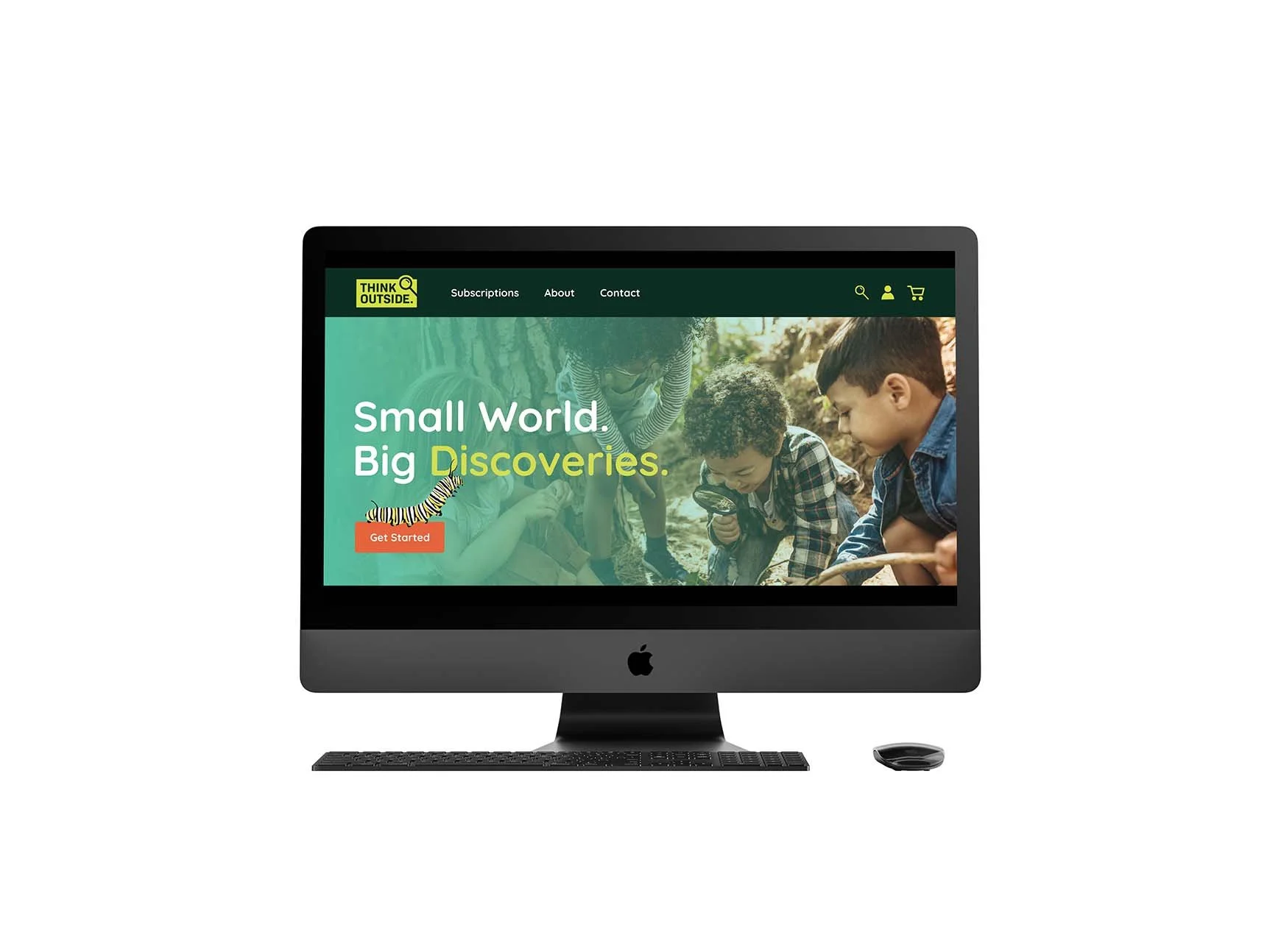
Website design
1 subscription box design
1 illustrated lesson booklet
1 poster fold with activities
1 craft kit with instructions
1 thank you card
3 stickers
Proposal
In today’s world, kids are glued to digital devices. According to the University of Rochester Medical Center, excessive exposure to screen time often contributes to neurological impacts for children such as attention difficulties, sleep issues, challenges with social interaction, and trouble regulating their behavior. Now more than ever, there needs to be an incentive for kids to enjoy the outdoors and connect with nature in a fun and interesting way.
Think Outside Boxes are a monthly kid’s nature themed subscription box service. I redesigned their brand and subscription boxes to be bug themed. This narrows the target audience and caters to children who are interested in insects. Doing this would make Think Outside uniquely stand out among their competitors of other nature subscription boxes.
My Think Outside bug subscription boxes would be a 3-month mail ordered subscription service that provides children with the opportunity to learn more about the insects in their environment. These boxes each contain an illustrated informational booklet that focuses on specific bugs that can be found outside during the months of June, July, and August. It includes a booklet with multiple lessons including topics such as: metamorphosis, habitat and ecosystem structures, defense from predators, and more. These boxes also contain various exciting nature activities, bug collecting equipment, crafts, and stickers.
Objectives
To independently research, design and produce a logo/brand redesign, subscription box packaging, website, illustrated booklet, poster fold with activities, craft kit, thank you card, and stickers for the brand Think Outside
To construct a niche theme that would target a more specific demographic
To create a fun aesthetic that appeals to children with an interest in learning about insects and nature
To research and apply trends in children’s media and subscription box services to create an overall successful project
To utilize skills in typography, illustration, package design, and web design to create a professional and cohesive look for the brand
To evaluate designed components by applying self-critique and critique from peers and instructors if necessary
To produce and present all elements with attention to detail and craftsmanship
Target Audience
The target audience for Think Outside are children who are interested in nature. Although these boxes can be enjoyed by all ages, the specific age demographic for this product is between the ages of 6 and 10. This subscription box could be appealing to children who are already nature-lovers or even to children who are not very familiar with nature but are curious to learn more. The bugs that are in the lessons of each month are based on bugs common to Northeastern United States. Theoretically, if this were a real type of subscription box, I would include the option to select different regions. This subscription would be purchased online typically by parents, grandparents, or even teachers. For this reason, I try to appeal to an adult audience in the website and thank you card design. The rest of the design elements are intended to appeal to a kid audience.
Think Outside
Think Outside Boxes is an existing subscription box service that sends monthly nature themed boxes with children’s outdoor gear and educational materials. This company was started by a family who intends to teach today’s youth to spend as much time outside as possible instead of spending hours watching a screen. Reduced screen time leads to improved behavior and better focus. Think Outside Boxes has been successful and has won awards for their service.
I believe fresh branding would bring them even more success. Their logo and branding are generic and outdated. Right now, they blend in too much with similar companies in the nature subscription box market. They need something that sets them apart from their competitors.
Research Synopsis
The research I did for this project started with looking at successful examples of kid’s subscription boxes in today’s market. One of my inspirations was KiwiCo©. I ensured that my project was accessible to my target audience by doing research on which typefaces kids can easily read. San serif typefaces are typically used in children’s media because it is similar to the letterforms kids learn to write. I used the typeface Quicksand in particular because early readers comprehend typefaces that have a single story letter “a” better than a double story letter “a.” I used bright colors in my branding including lots of green hues to tie in the nature feel of my branding without being too overstimulating.
I have rebranded Think Outside to narrow their topic to just insects. By taking the time to master a few topics, it helps to increases a child’s understanding and memory. This is beneficial compared to accelerated learning, which quickly goes through multiple topics without taking the time to develop complete understanding. My version of the subscription boxes would be only active during the summer months compared to Think Outside’s current year-long subscriptions. I think that my rebrand would make this company popular enough that they wouldn’t lose profit by limiting the subscriptions to just a few months. Children tend to lose interest in activities that are always available to them. Parents might unsubscribe if they think their children are uninterested. Additionally, the monthly summertime subscription boxes would be something kids would look forward to each summer. The original Think Outside mission statement is to instill a love of the outdoors in children and provide them with knowledge and skills to improve their confidence and appreciation of the natural world. In my rebrand, I have successfully accomplished their mission statement and more by encouraging exploration, fun, and creativity.
Logo Process
I wanted my logo to have the type “Think Outside” inside a box as a nod to the saying “Think outside the box.” In early variations, I experimented with a bug in the logo and a magnifying glass in the logo. The magnifying glass is intended to represent learning and curiosity. I tried magnifying one of the letters in the logo to create visual interest but realized that it became too much of a focal point.
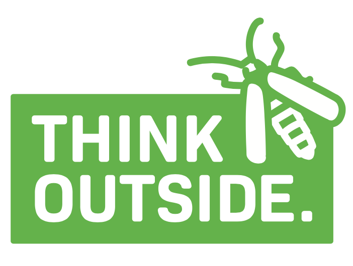
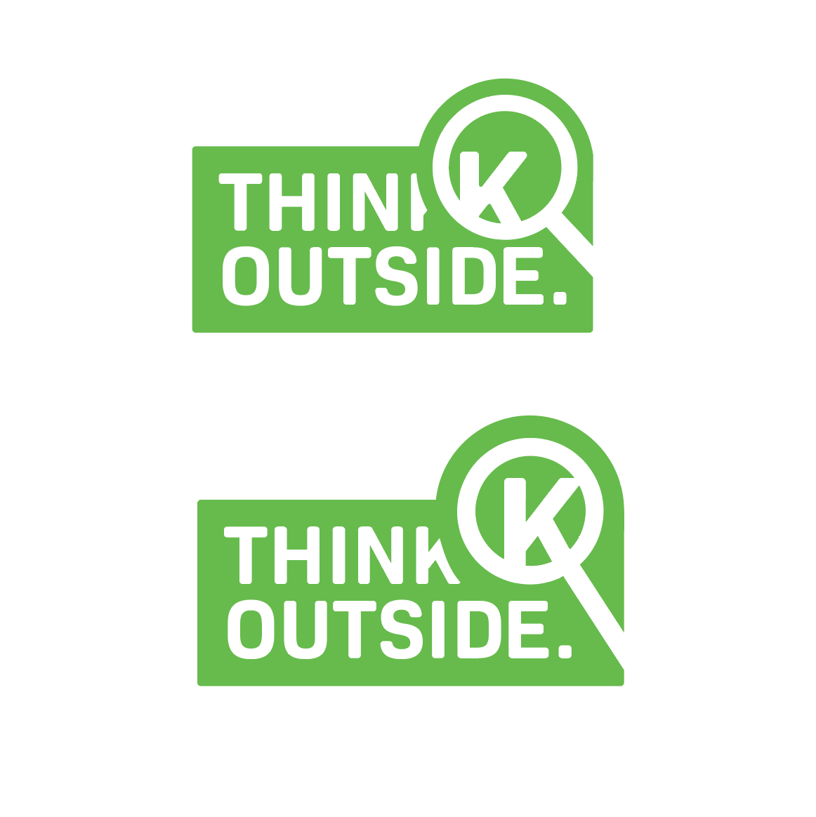
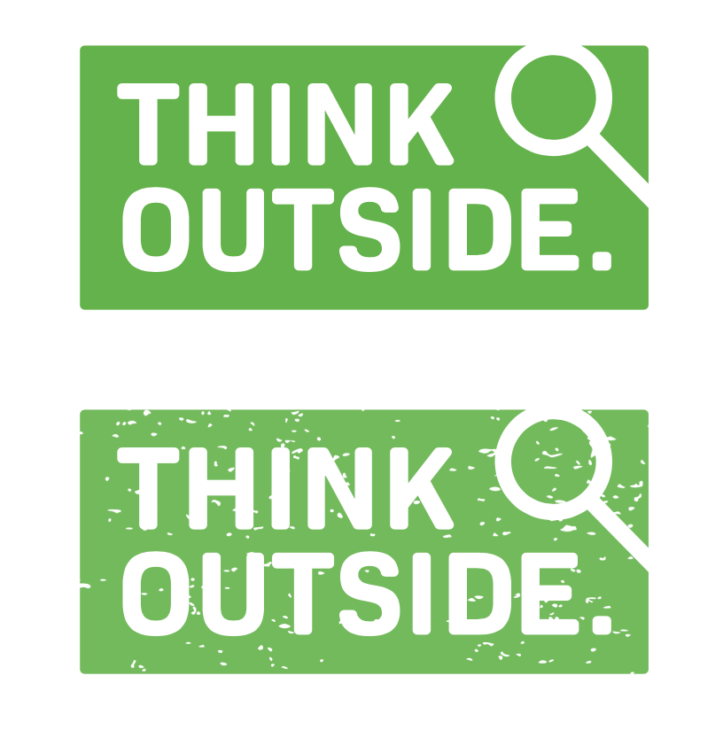
Final Logo
For the final logo solution, I decided to keep my logo simplistic and readable. I chose to have the magnifying glass break the edges of the box and fill the space above and to the right of “Think Outside.” I added a small glare on the glass. The end of the handle extends to the edge of the box but closure connects that space. The typeface I used is an altered version of Bio Sans. I used this typeface because it compliments the rectilinear shape of the box the type is contained in.

Illustrations Process
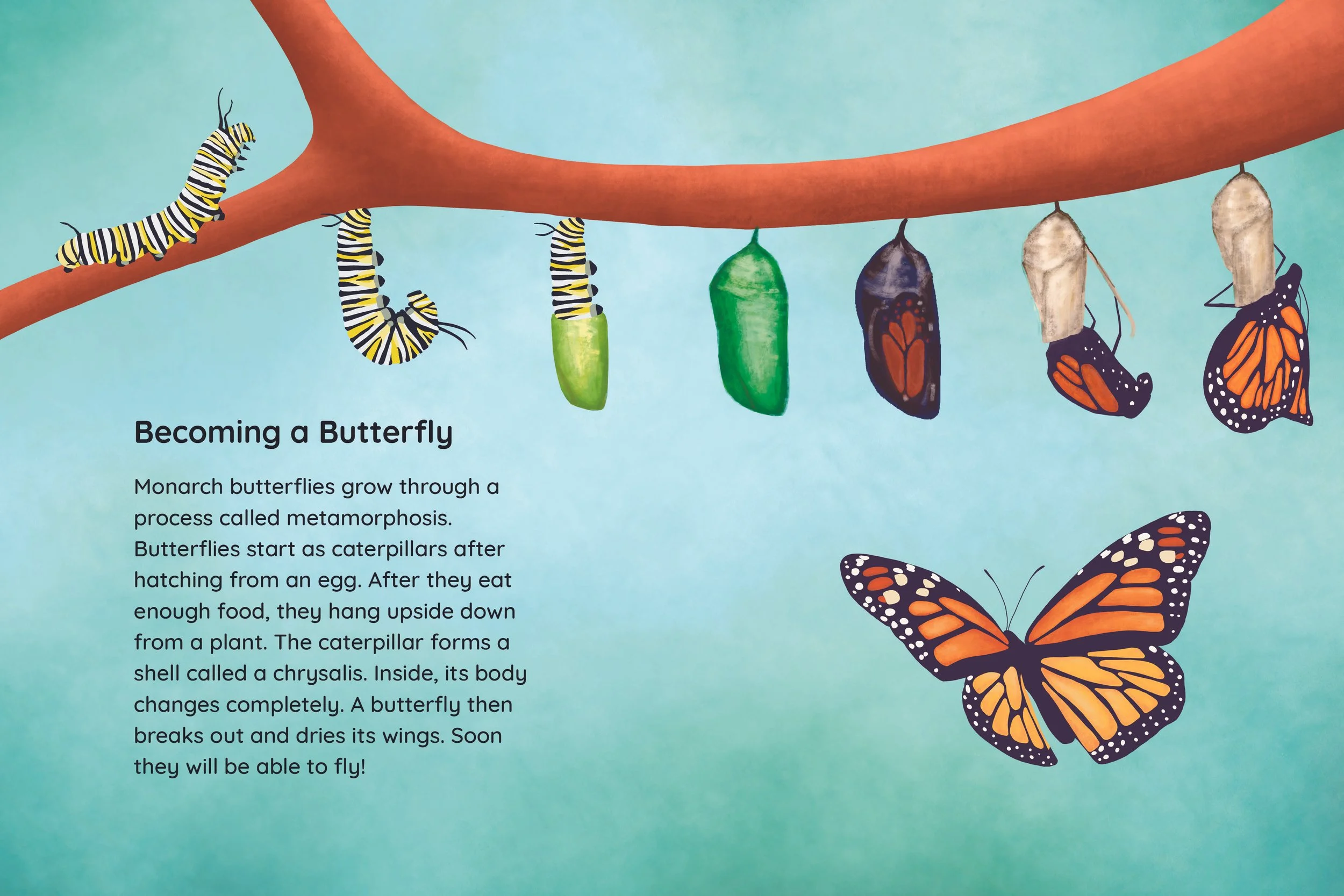
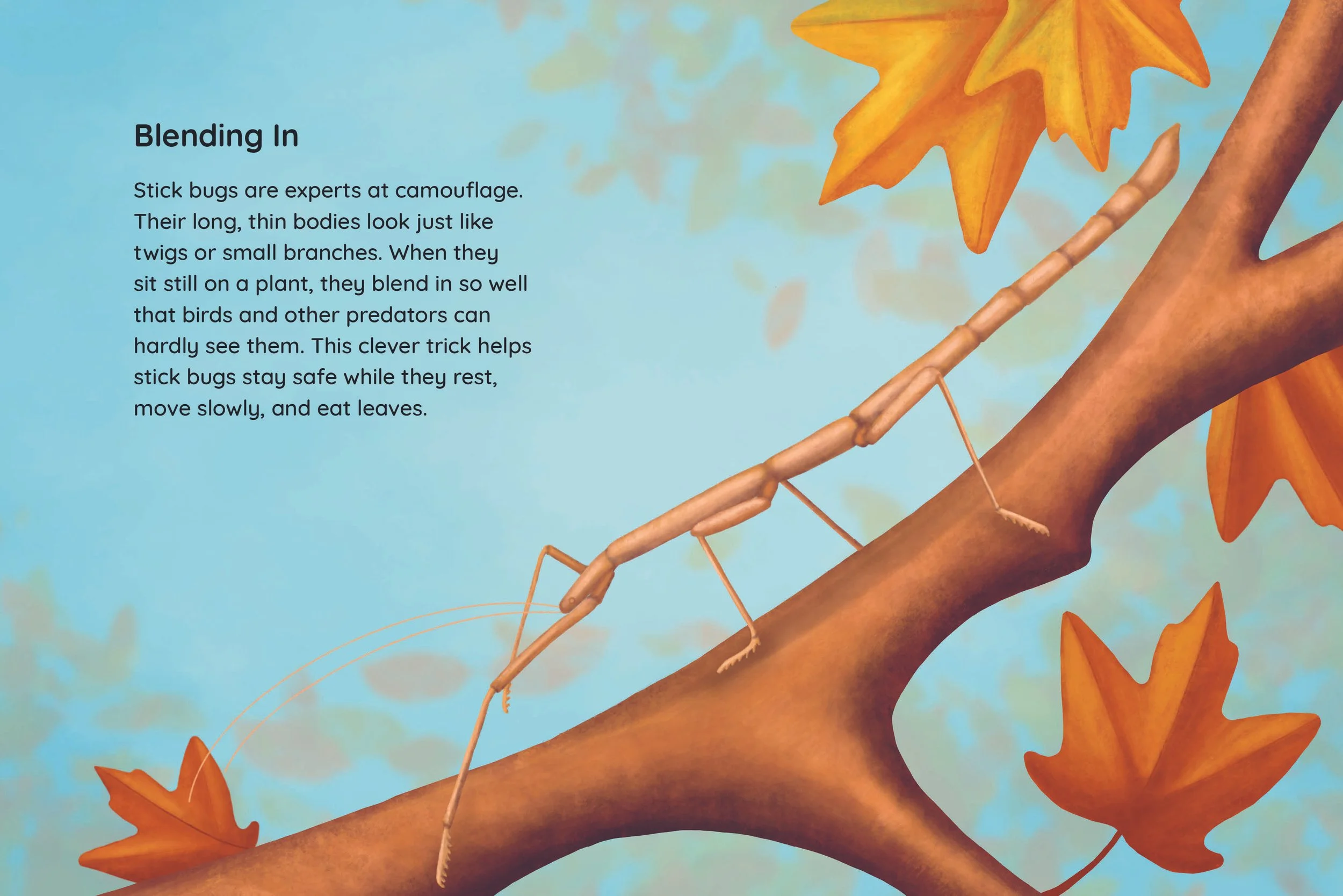
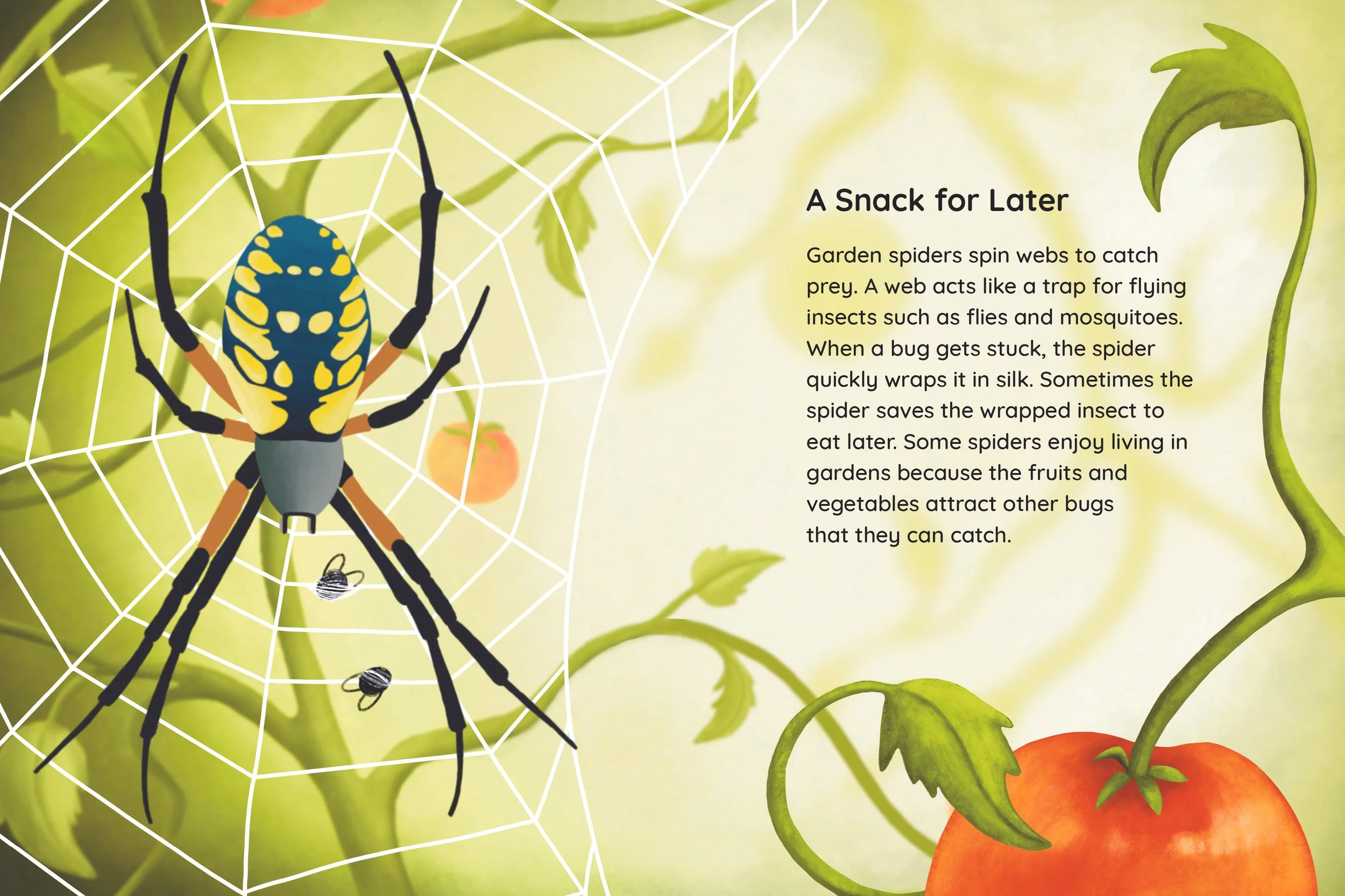
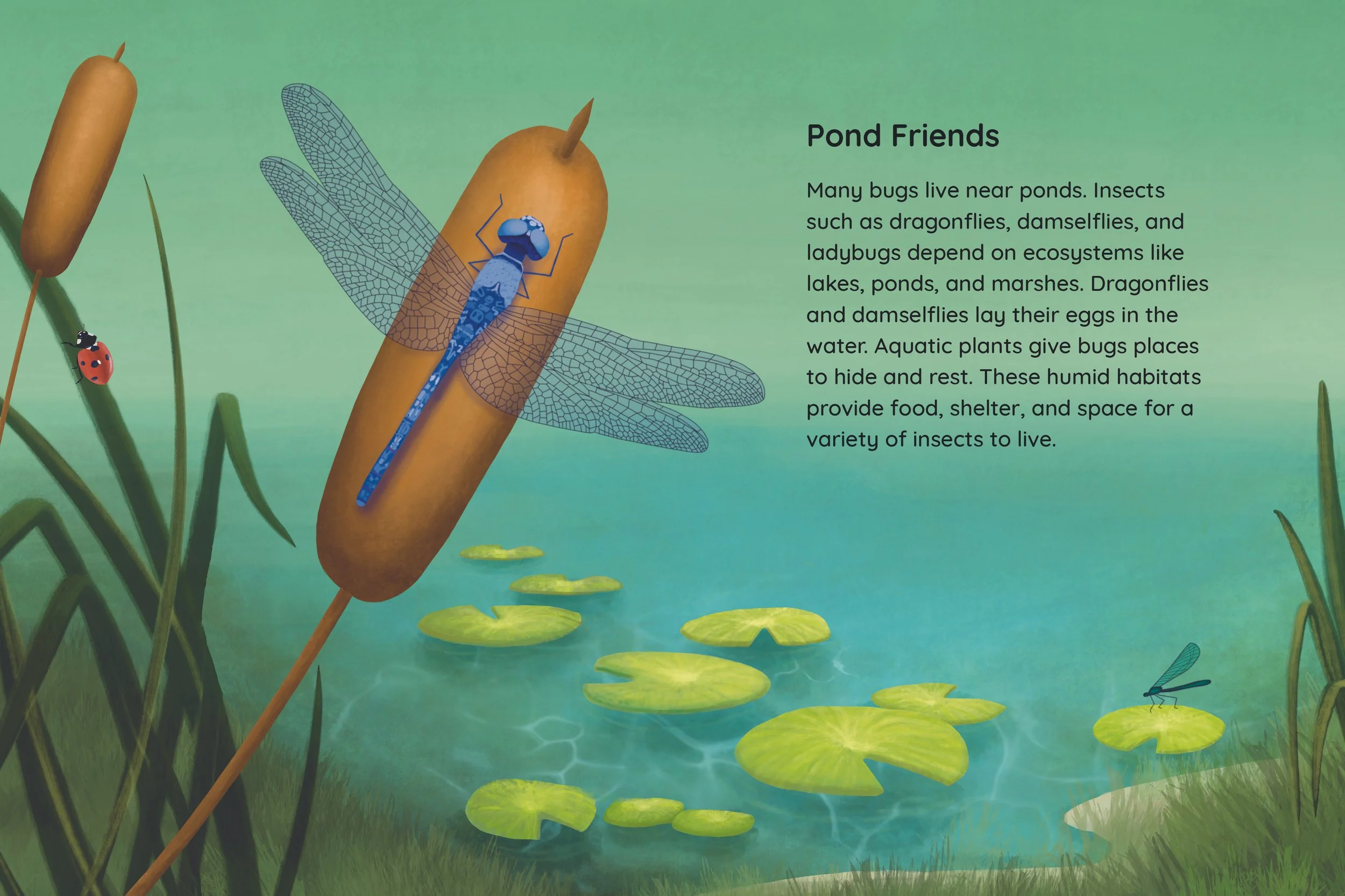
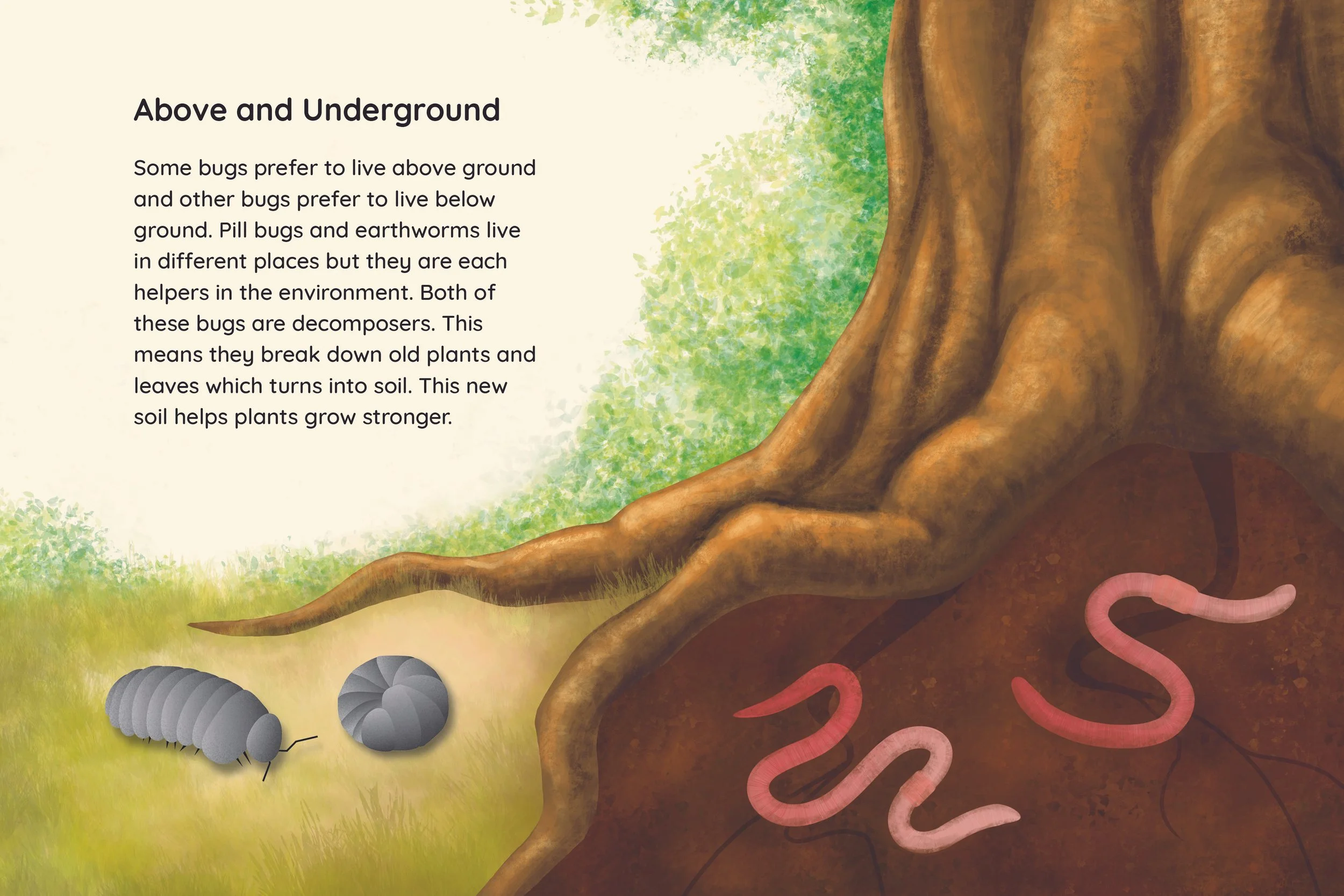
The largest part of my project was my illustrations. I intentionally created an ABA format for my pages to create variation in the placement of the text. I used the iPad app Procreate to make my illustrations before exporting them to inDesign. In the rough stages of the spreads, my focus was on composition. I had used images of insects as a temporary placeholder.
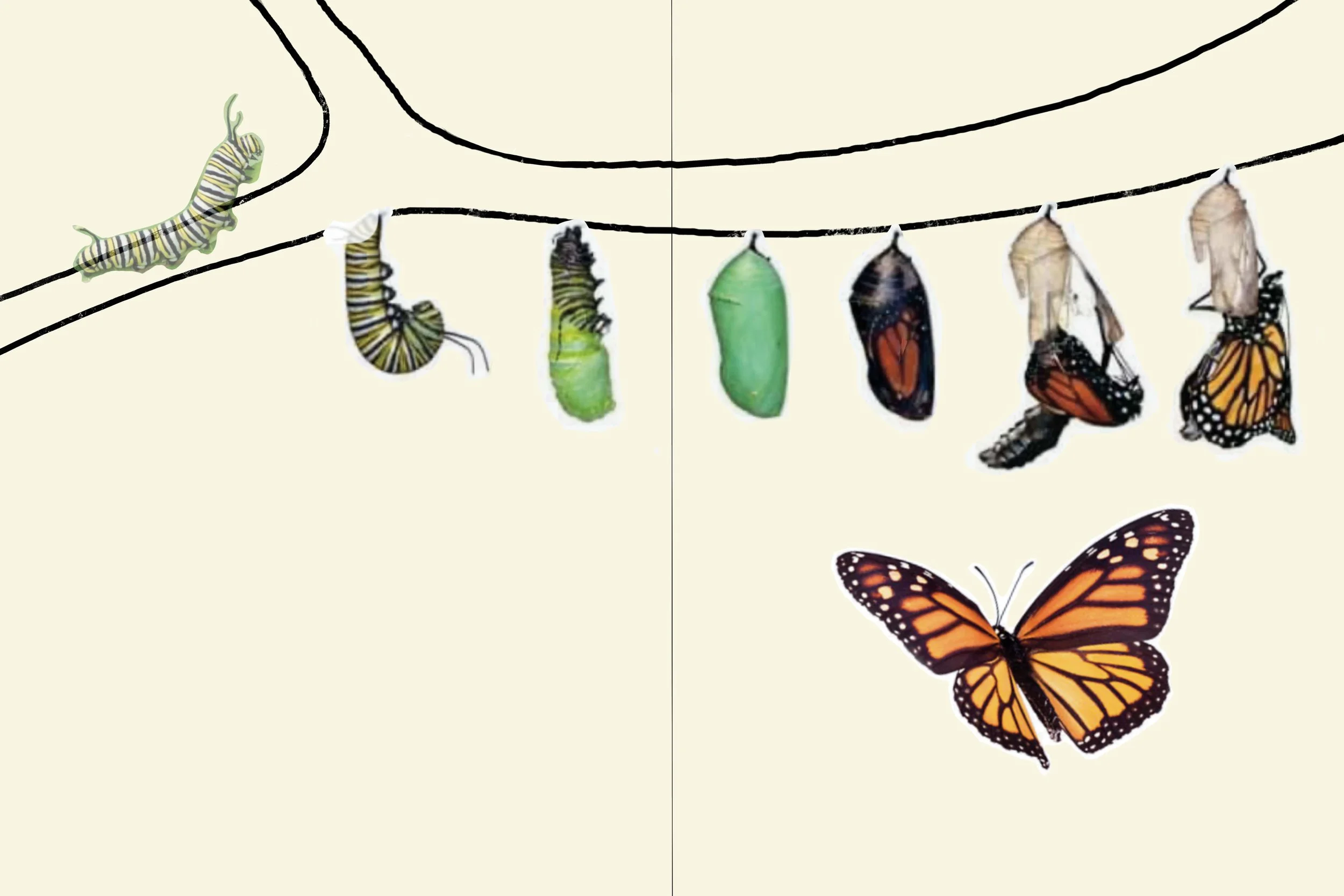
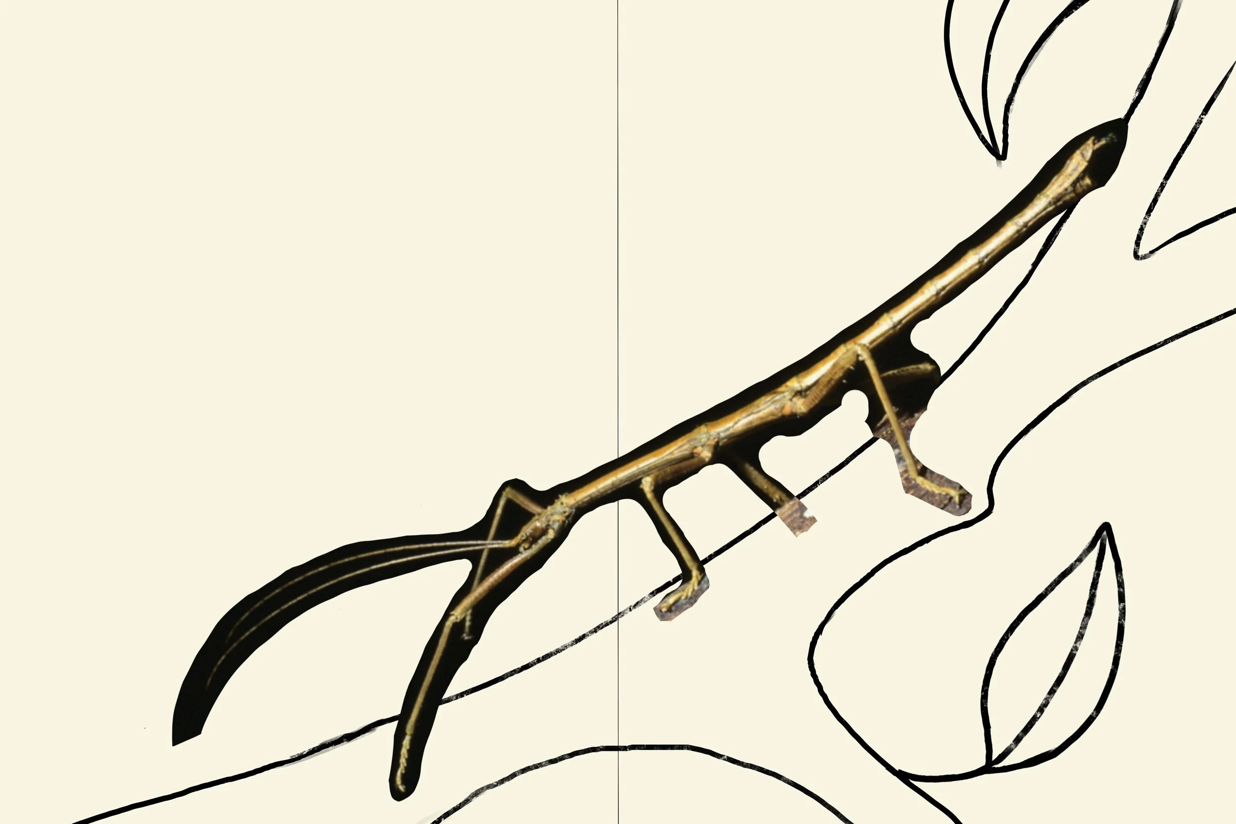
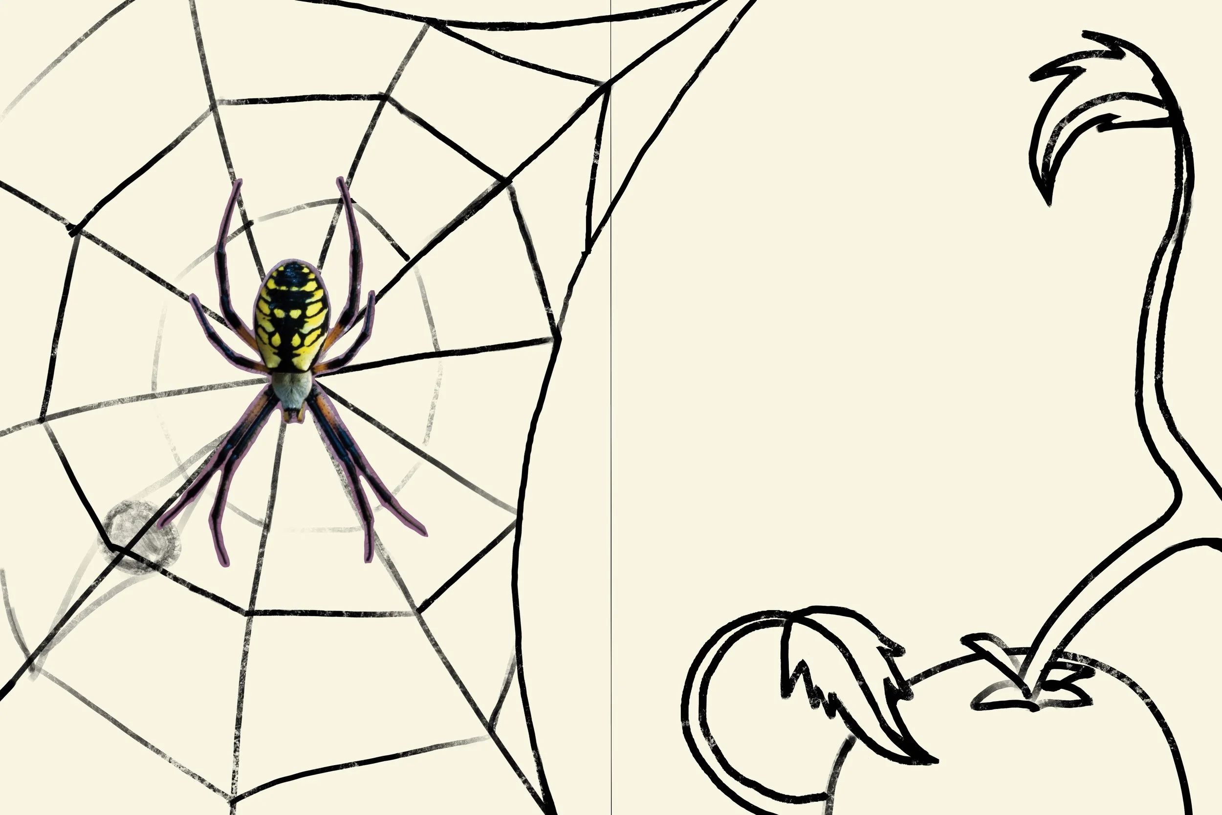
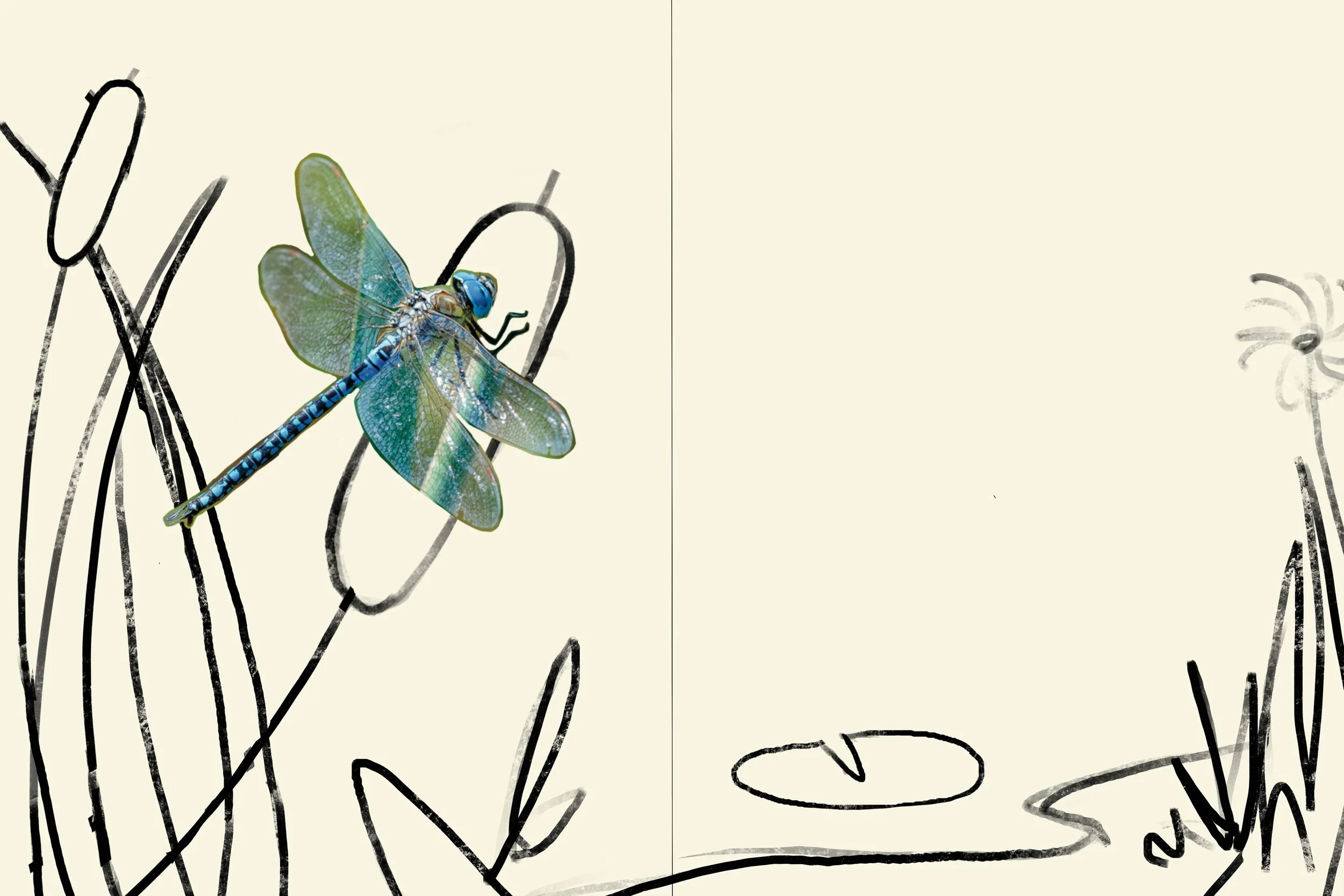
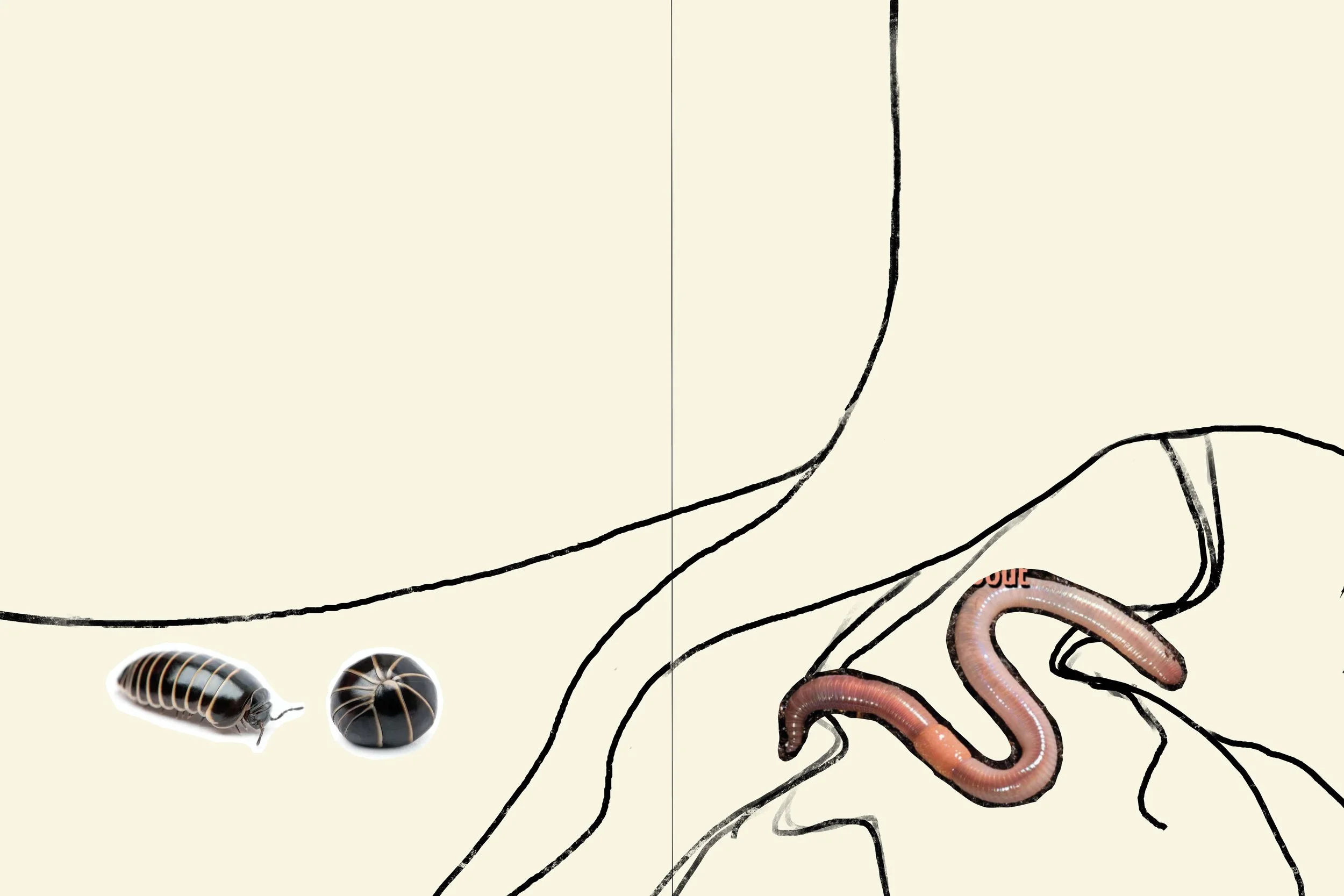
Final Illustrations
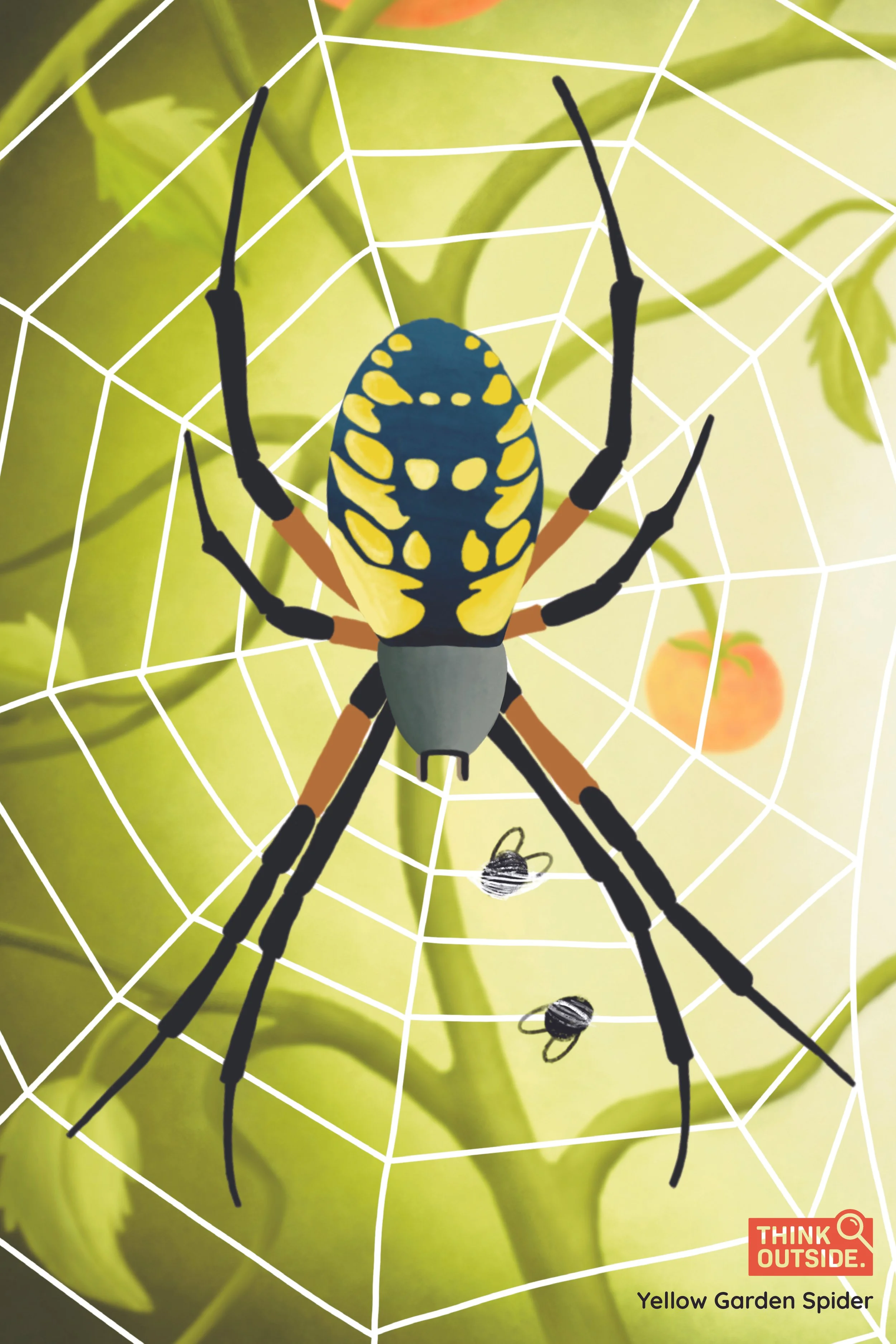
I used a semi-realistic style of rendering for my illustrations. After the illustrations were completed, I used the bugs as elements throughout my entire branding. I eventually added more content to my illustrated lesson booklet such as: a list of key words with definitions, rules for safe exploring, fun facts, and an answer key for the activities I created. My three stickers for this project were the butterfly, spider, and worm.
Subscription Box Process
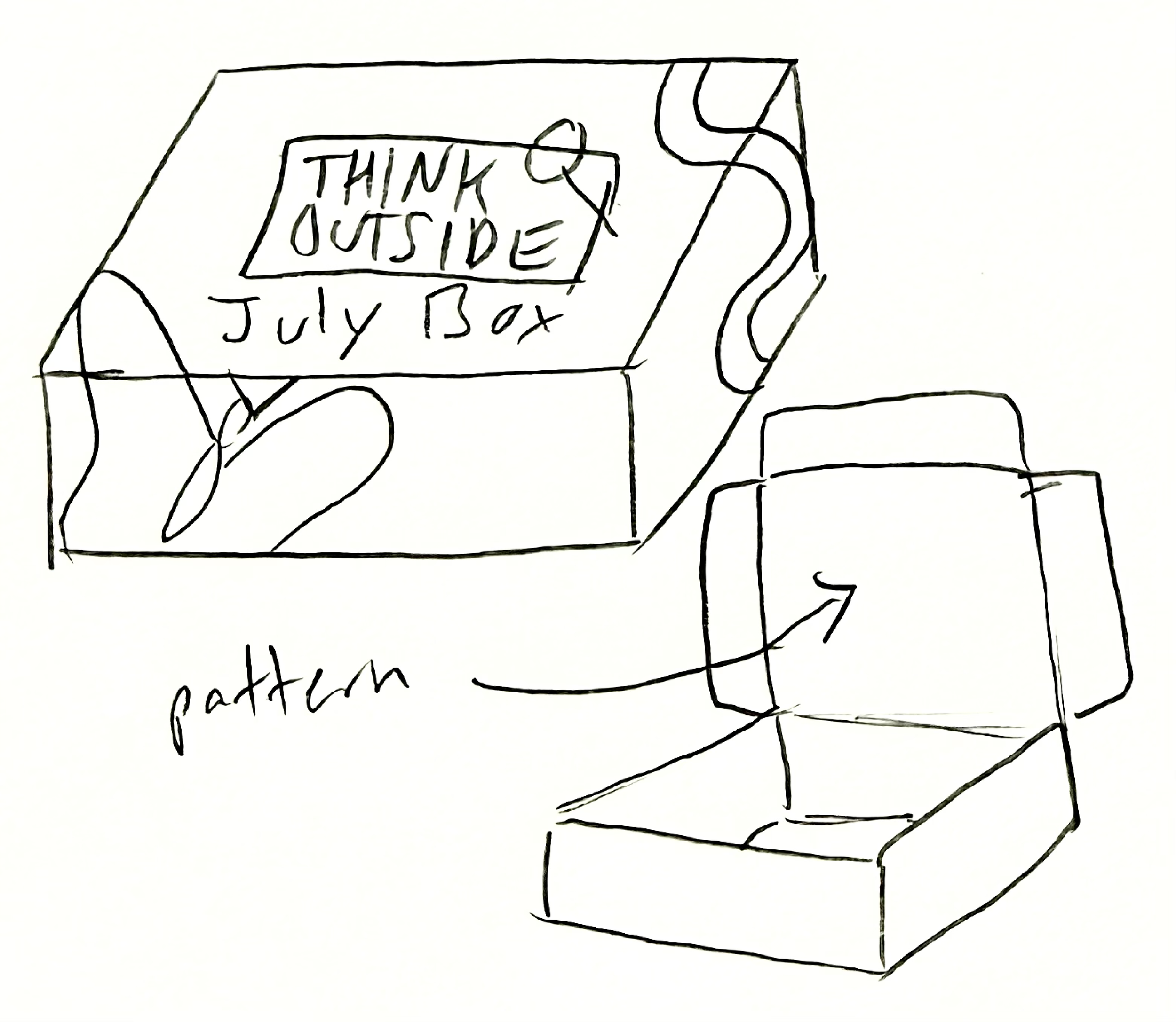
For my box packaging, I decided to design the the July edition of my subscription boxes. I planned for my box to have the Think Outside logo large on the top of the box. My illustrated bugs would cover the outside of the box. I planned to have some sort of faint pattern on the inside of the box.
Final Subscription Box
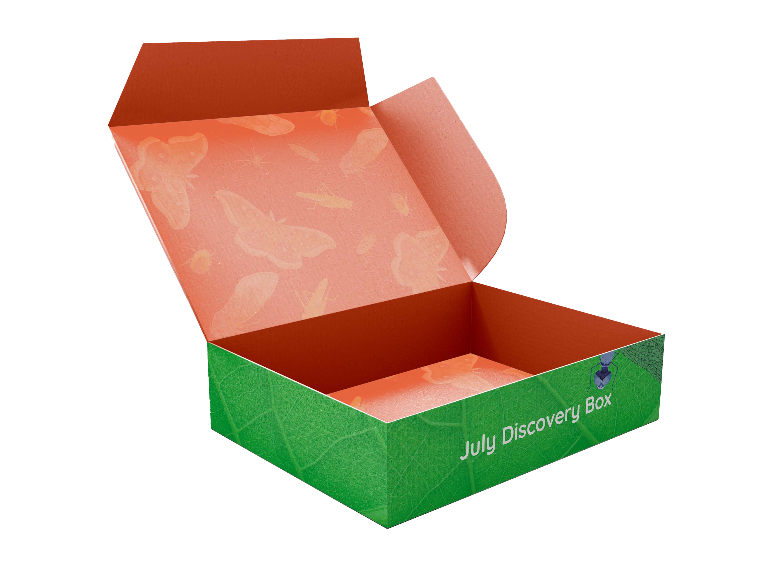
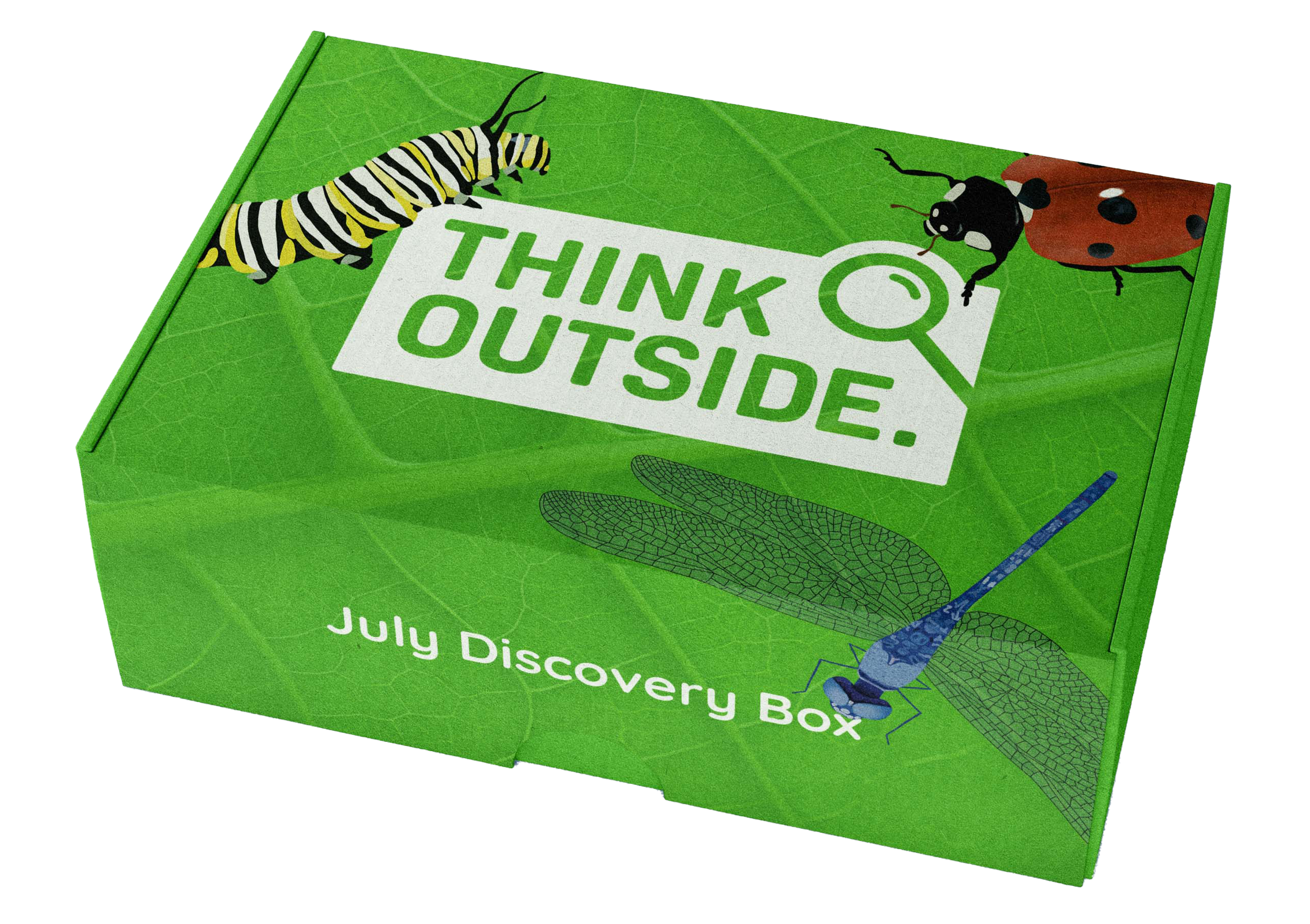
For the packaging of my final subscription box, I used a green leaf texture in the background. I also used this leaf texture on the cover of my lesson booklet and on some of my website pages. The front of the box has the text “July Discovery Box.” My final logo and illustrated insects are decorated on the lid of the box. For the interior, I created a faint pattern using bugs that would theoretically be featured in next months subscription box.
Activities Process
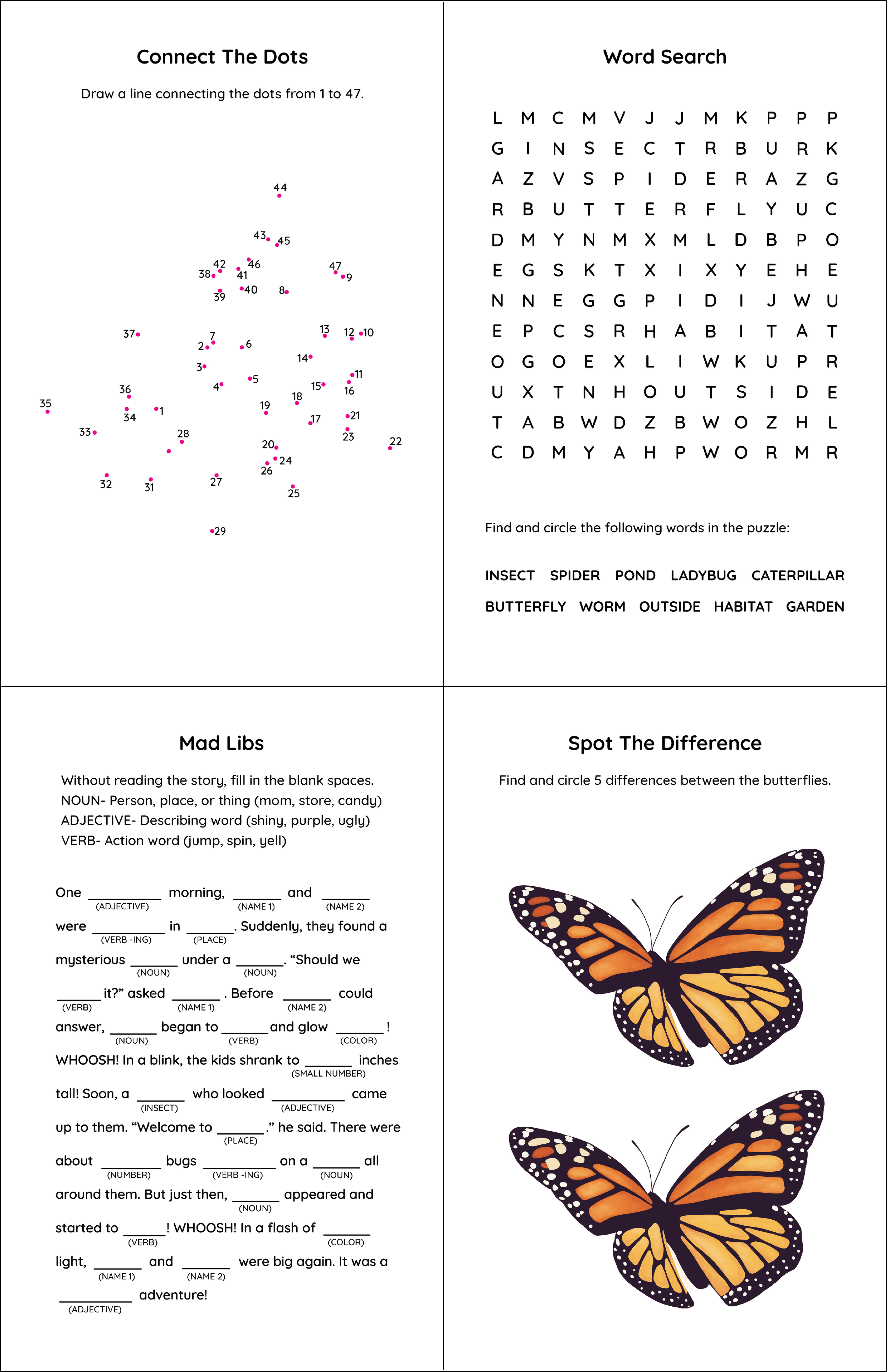
I decided to create four activities: connect the dots, word search, Mad Libs®, and spot the difference. To make the connect the dots, I placed dots over my ladybug illustration and traced them. I numbered the dots and removed the lines. I came up with ten words for a word search puzzle and used an online generator to scramble the letters. I recreated the word search using my branded typeface. I came up with a Mad Libs® story by researching existing Mad Libs®. I altered my butterfly illustration to make five differences from the original.
Final Activities
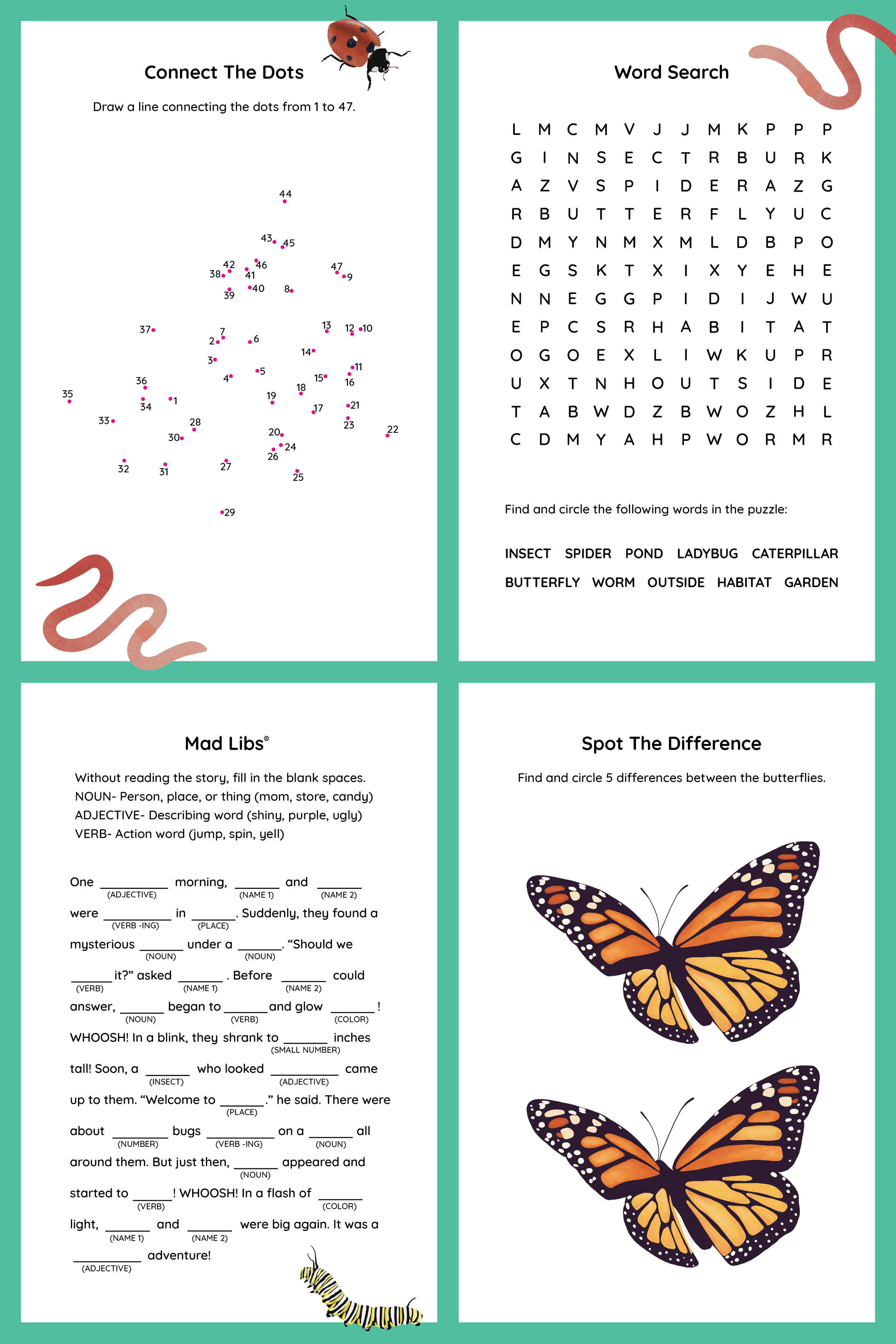
I decided to turn my activities into a poster fold. One side has four activities and the other has a poster of my illustrated spider. I added branding elements to the activities side such as the teal borders and extra bugs for decoration.
Craft Kit Process
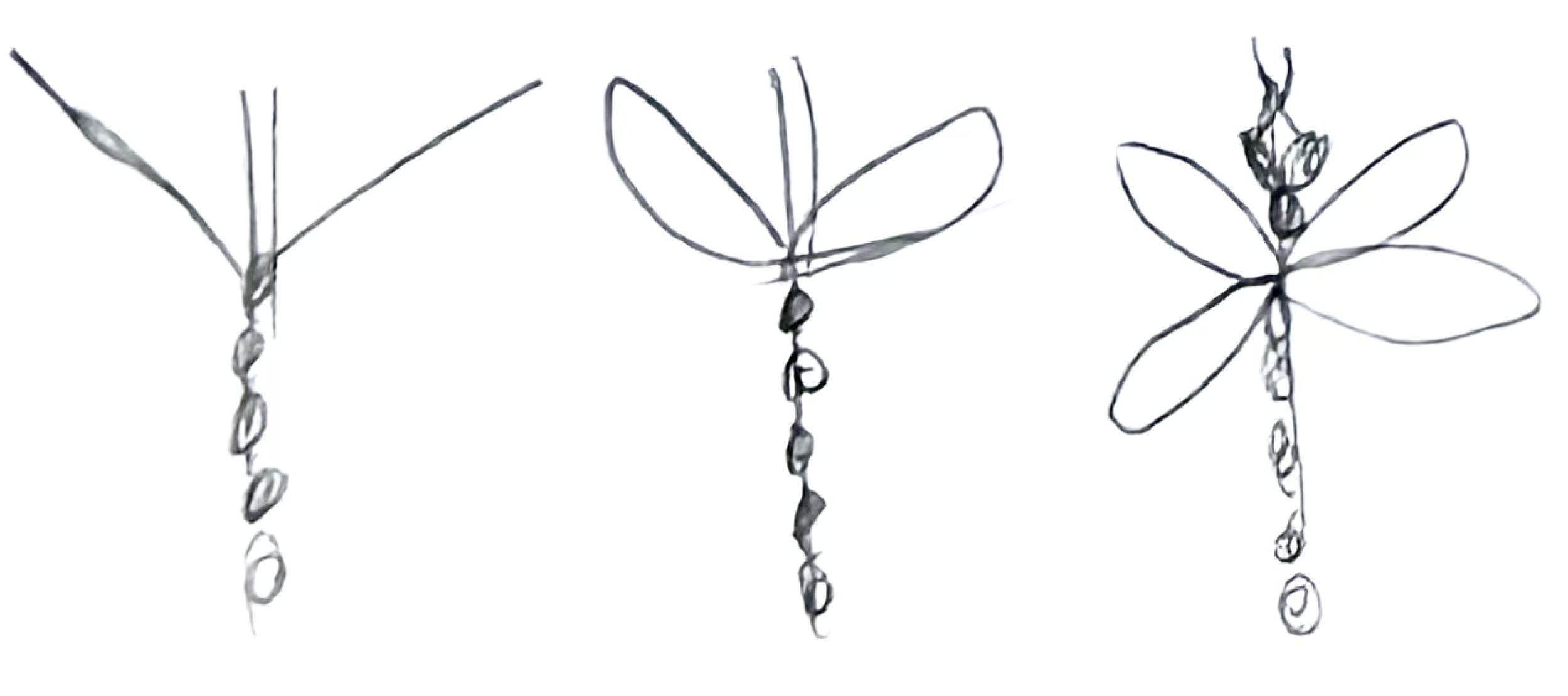
I knew I wanted to include a craft kit and instructions that uses pipe cleaners and beads. I couldn’t find any crafts online that I liked so I started experimenting and created my own craft. I did it a second time to document my steps.
Final Craft Kit
I used Adobe Illustrator to create step by step visuals of my craft instructions. I included all of the materials for this craft in a small package in the subscription box.

Thank You Card Process
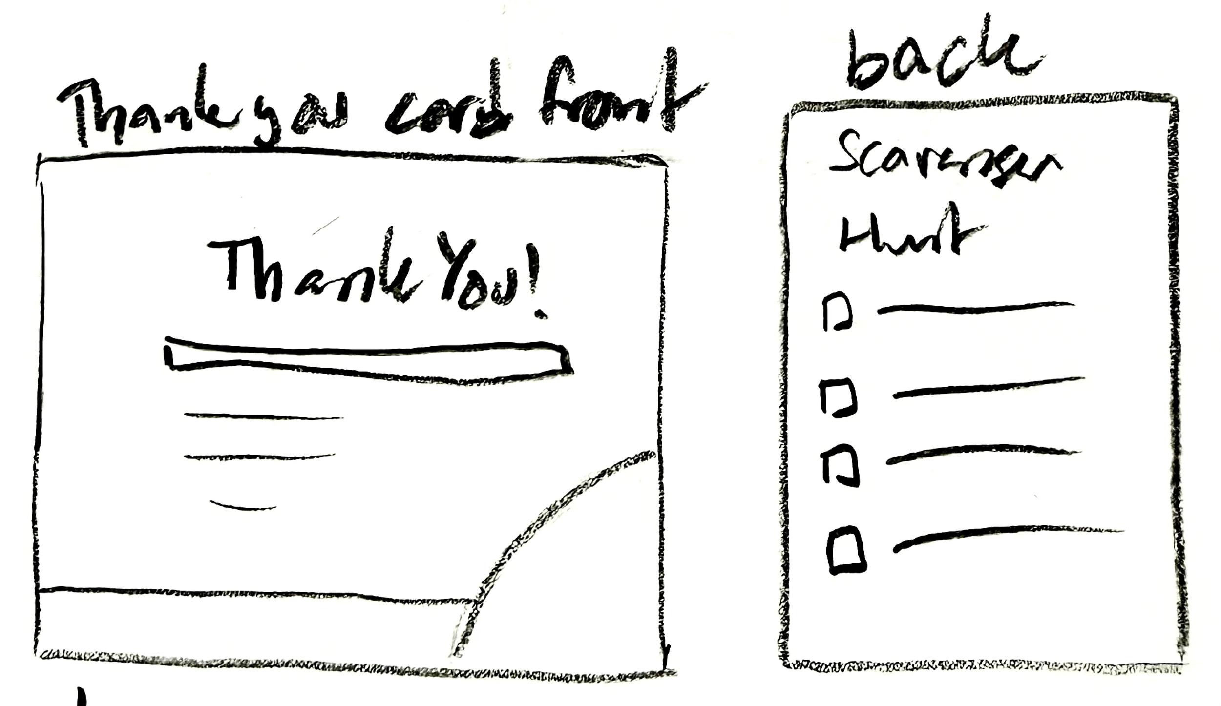
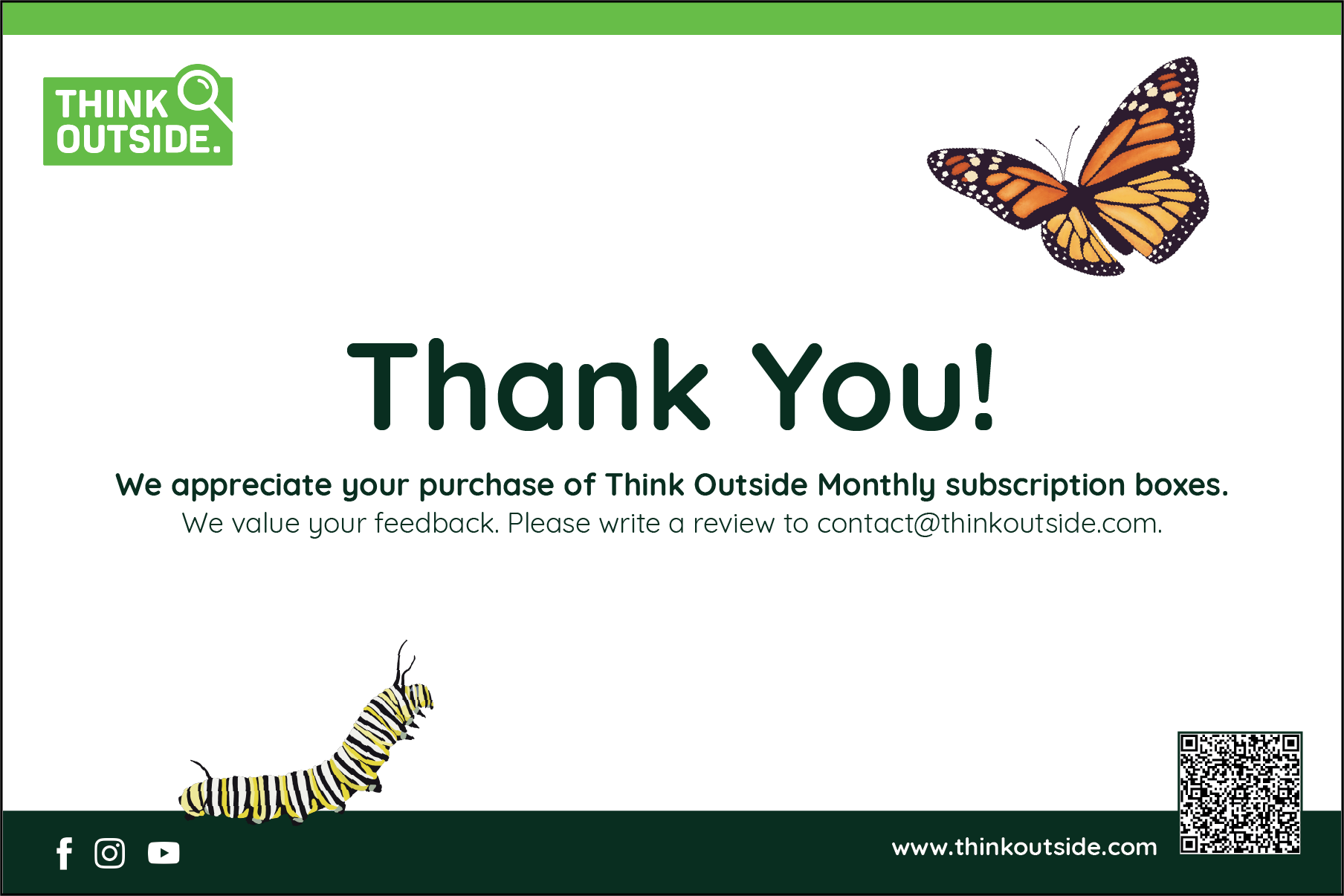
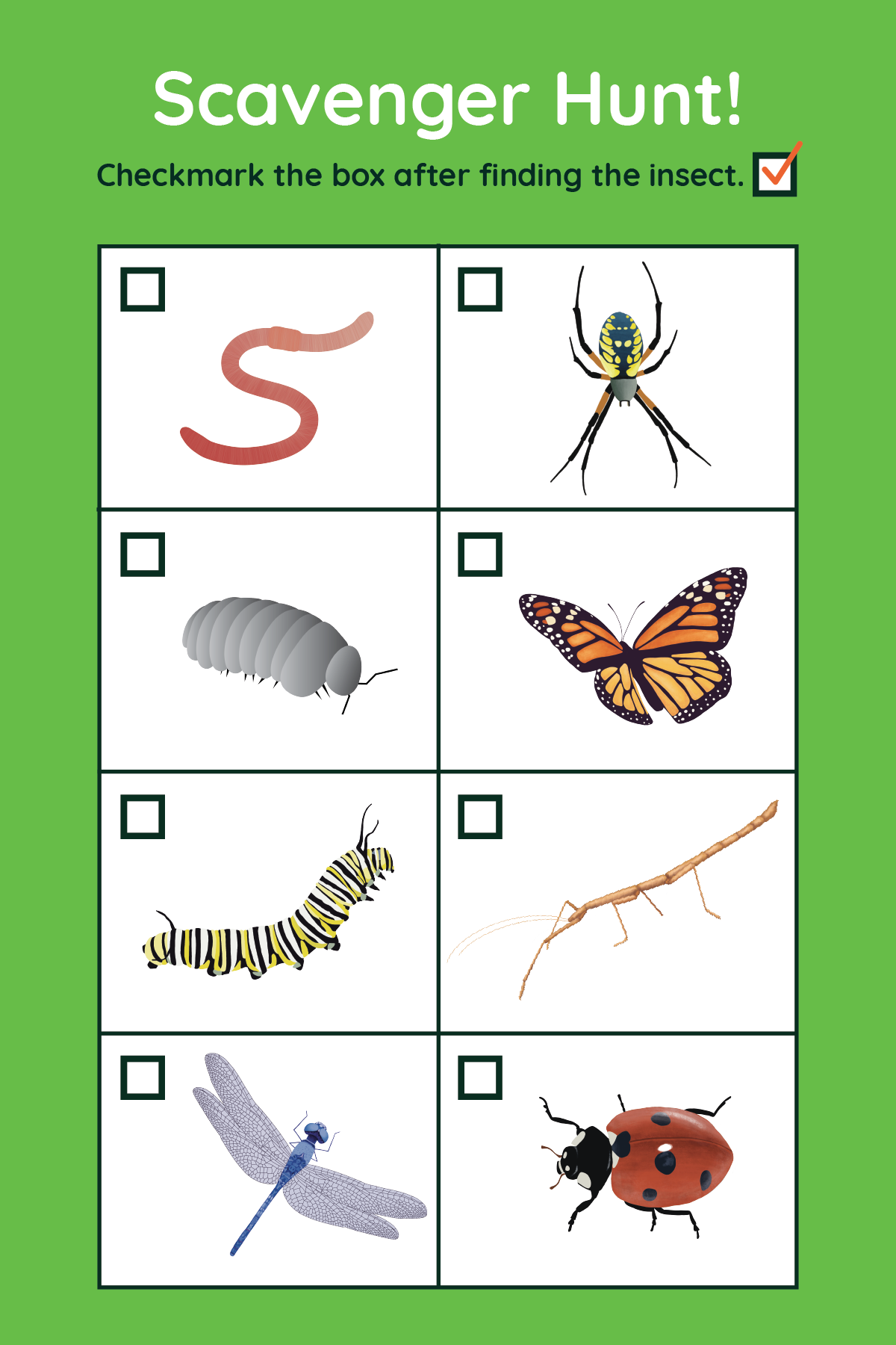
I wanted my thank you card to be branded similarly to my website because I intended for it to be read by the person who purchased the subscription. I played around with the idea of using the back as a scavenger hunt checklist.
Final Thank You Card
My final thank you card includes a message to the adult who purchased the subscription and information for writing a review, as well as a QR code to my website. The back of the card contains a scavenger hunt with pictures of each bug to find.